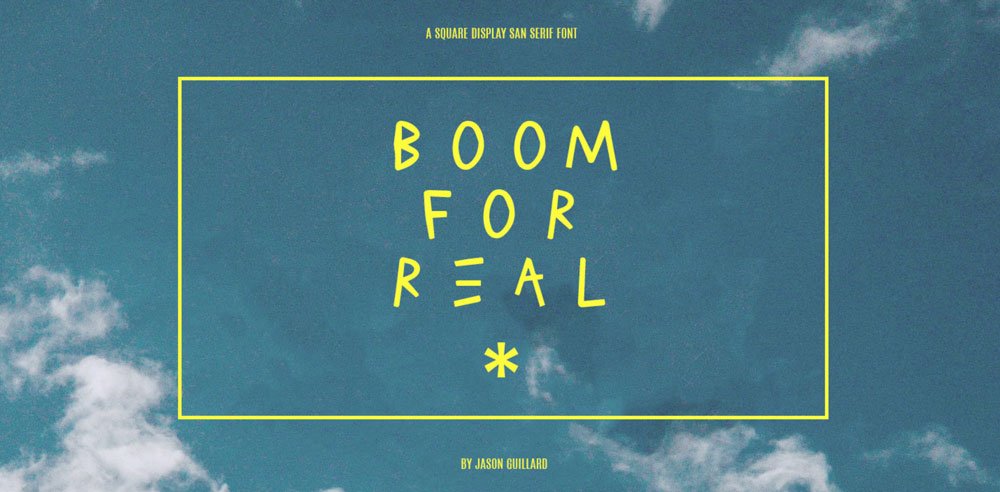
boom for real
2022
an experimental display font inspired by jean-michel basquiat’s graffiti style. the typeface was hand-drawn and then digitized, playful, stylish, and raw. my first type design project, created to channel street energy into letterforms.
concept
boom for real was born out of the raw, impulsive energy of basquiat’s graffiti. the goal was not to imitate, but to translate his approach into a letterform system, loose, imperfect, and alive. a font that feels like it was written on a wall, not drafted on a grid.
process
each character was first drawn by hand in marker and ink, embracing irregular edges and spontaneous strokes. those drawings were scanned, refined, and digitized into a functioning display typeface. being my first font, i wanted to keep the process playful rather than overly technical.
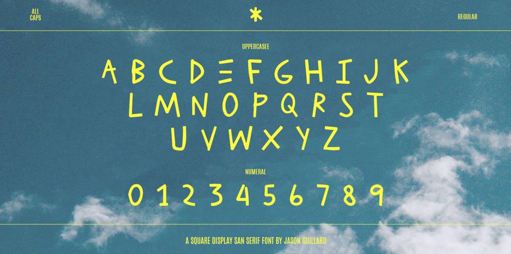
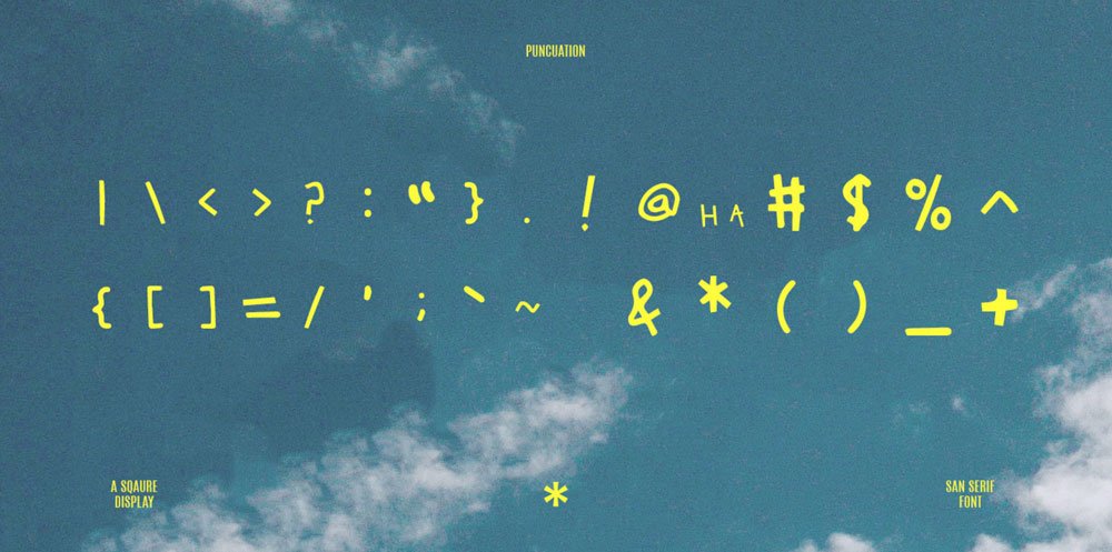
character set
the typeface contains a full a–z alphabet, numerals, and select punctuation. each letter carries the same raw energy, lines uneven, proportions exaggerated, but together forming a cohesive rhythm. it was designed to work best in short headlines and graphic contexts.
a–z
hand-drawn letters digitized into a full alphabet
numerals
single-line, angular forms to match the alphabet
punctuation
marks simplified and stylized for display use
impact
boom for real marked my entry into type design. it established a process of treating letters as expressive forms rather than neutral tools. the font has since been used in posters, zines, and experimental layouts, carrying forward the raw, playful energy it was built on.

inquiry
for project inquiries, licensing, or type collaborations, please contact via email.
download cv
about
jason guillard’s practice examines the lifecycle of material forms across garments, footwear, type, publications, and public spaces. his work builds clarity from contrast, using minimal interventions to create presence, narrative, and cultural anchors.